
Logo Design Fundamentals: From Concept to Execution
Learn the essential principles of logo creation—from understanding negative space to exploring typography-based marks and symbol design.
Master the art of building a consistent visual language that communicates your brand’s essence across every touchpoint
You’ve probably noticed how certain brands immediately feel recognizable. It’s not always about a single logo—it’s the entire visual system working together. Colors, typography, imagery style, spacing, textures—they all tell a story that builds trust and creates recognition.
When these elements work in harmony, customers don’t just see your brand; they experience it. They can spot your content on a crowded Instagram feed or recognize your packaging from across a retail shelf. That’s the power of cohesive visual storytelling. It’s what transforms a business from forgettable to unforgettable.
Your visual language isn’t created overnight. It starts with understanding your brand’s personality and what you want to communicate. Are you modern and minimalist? Warm and approachable? Bold and energetic? These questions guide every decision that follows.
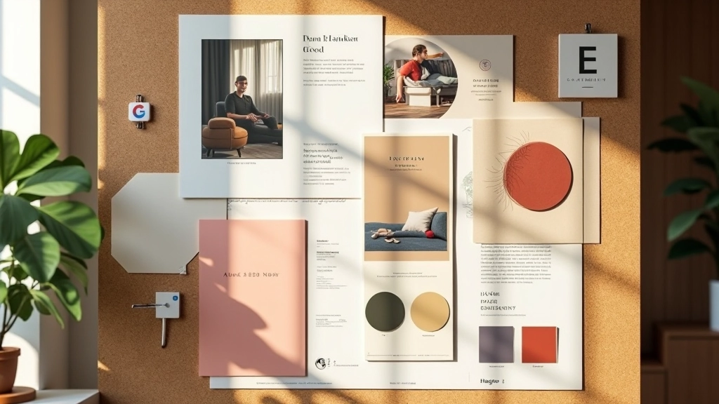
The foundation involves five key components. First, your color palette—typically 3-5 primary colors that appear consistently. Next, typography, which includes 2-3 font families maximum (one for headings, one for body text, occasionally a display font). Then comes imagery style: Are your photos vibrant and saturated, or muted and editorial? Are they real photographs or illustrated? Do you use people, products, or abstract concepts?
You’ll also establish patterns and graphic elements—perhaps a specific way you use shapes, lines, or textures. Finally, white space and composition rules ensure every design feels like it belongs to your system, even if different people create it.

This article provides educational information about visual branding principles and best practices. The techniques and frameworks described are general guidelines intended to help you understand brand identity development. Every brand is unique, and the specific application of these principles will vary based on your industry, target audience, and business objectives. Consider consulting with professional designers or brand strategists for customized guidance tailored to your specific situation.

Where visual storytelling gets real is when you apply it everywhere. Your website should feel like your Instagram. Your business card should match your email signature. Your packaging should speak the same language as your social media graphics. This doesn’t mean everything looks identical—it means they all belong to the same visual family.
Think about how major brands handle this. You’ll see the same color palette, the same typography, the same composition style across digital and print. It’s not coincidence. It’s deliberate design that builds recognition. When a customer sees your product in a store, scrolls your website, receives an email, or walks into your physical space—they should recognize you immediately.
The practical side involves creating templates and systems. You’re not reinventing design for every single asset. Instead, you’re working within a flexible system that ensures consistency while allowing for variation. A social media post template uses your typography, colors, and spacing rules. Your email template follows the same grid system. Your presentation deck uses the same graphic elements.
Photography is often where visual storytelling either succeeds or falls apart. Not because photography is difficult, but because it’s such a visible element that any inconsistency stands out immediately. When you’ve defined your imagery style, you’re making specific choices about what your brand looks like in photographs.
This might mean: lifestyle photography showing your products in real contexts, rather than sterile product shots. Or editorial photography with muted colors and interesting compositions. Or vibrant, saturated imagery that feels energetic and modern. Maybe you always photograph people at eye level and close enough to see expressions. Maybe you prefer environmental portraits showing people in their spaces.
The specificity matters. A healthcare brand might consistently use photography with warm, neutral tones and genuine human moments. A tech brand might use clean, modern photography with minimal distractions. A lifestyle brand might embrace bold colors and dynamic compositions. When every image follows these principles, your brand’s visual voice becomes unmistakable.
Beyond photography, consider illustration style, graphic treatments, and how you use icons. If you use illustrations, are they hand-drawn and organic, or geometric and digital? Are icons simple line-based, or do they have more visual weight? These choices compound to create your complete visual identity.


All of this lives in your brand style guide—or brand book. This isn’t just a design document; it’s your visual rulebook. It explains why your brand looks the way it does and how to maintain consistency whether you’re designing a billboard or a tweet.
A comprehensive style guide includes your logo with clear space requirements and minimum sizes. Your color palette with exact specifications (hex codes, RGB values, CMYK for print). Typography with font families, weights, sizes, and usage rules. Imagery guidelines describing your photography and illustration style. Spacing and grid systems showing how elements relate to each other. Examples of applications across different mediums.
You’ll also document what not to do. Mistakes to avoid. Color combinations that don’t work. Typography pairings that feel wrong. This “don’ts” section is surprisingly valuable because it prevents inconsistency. When a new team member joins or a freelancer starts a project, they’re not guessing—they’re following a clear system.
The best style guides are living documents. They evolve as your brand matures. But the core principles—the visual language that makes you recognizable—should remain consistent. That consistency is what builds brand equity over time.
You don’t need to have everything figured out immediately. Start by looking at what you’re already doing. What colors appear most in your current marketing? What fonts have you been using? What kind of imagery resonates with your audience? You’re probably already showing signs of visual preferences—you just need to make them intentional.
Create a mood board. Collect images, colors, typography samples, and design styles that feel aligned with your brand. Don’t overthink it—if it feels right, it probably is. This mood board becomes your visual north star. It’s easier to make decisions when you have a reference point.
Choose your core colors. Pick 3-5 colors maximum. Include a primary color that feels distinctly yours, secondary colors for variety, and neutral colors (grays, whites, blacks) for backgrounds and text. Test these colors together. Do they create good contrast? Do they feel cohesive? Do they communicate what you want them to communicate?
Select your fonts. Pick one for headings and one for body text. They should complement each other and be distinct enough that they work together. Test them at different sizes. Make sure body text is genuinely readable. This might sound basic, but many brands fail at readability in pursuit of style.
Then comes the iteration phase. Apply these choices across a few designs. A social media post, an email, a document. How do they feel together? What adjustments would improve them? You’re building your system through practice, learning what works as you go.
Creating cohesive brand aesthetics isn’t about being precious about design. It’s about building recognition, trust, and emotional connection through visual consistency. When your customers see your brand, they shouldn’t have to think about whether it’s really you—they should immediately recognize it.
The brands that succeed aren’t always the ones with the most expensive designers or the trendiest aesthetics. They’re the ones that commit to a visual language and live it consistently. They understand that every design choice—every color, every font, every image—is an opportunity to tell their brand story.
Start where you are. Look at what you’re already doing. Identify the patterns. Make intentional choices. Document them. Apply them consistently. That’s how visual storytelling becomes a competitive advantage. It’s not magic—it’s just thoughtful, committed design that respects your audience enough to be clear, consistent, and recognizable.
Ready to build your brand’s visual system? Explore our complete guides on brand identity and design.
Explore Brand Identity Guides